


Totally Tapped
A consistent, professional brand feel, WITHOUT losing their weird and wonderful identity.


Jonny
Me

Ginny & Rob are two of the hardest grafters I’ve met - they have worked tirelessly to create such a vibrant, unique space for their Beeston-based business.
I came on board to help them re-brand when they knew they had to move to a new space, and they saw an opportunity to re-align their visual identity with their changing business.
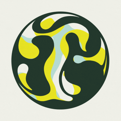
I loved creating the swirling, fluid, bubbling logo, with subtle lettering incorporated. It was so fun to do, and along with the quirky bespoke font created something truly unique.
Although the original brief didn’t include an animated version of the logo - I couldn’t help but see the potential, so brought Jonny in to add his usual sprinkle of magic.
“From the start Anna listened to our needs and preferences, really dug into who we were as people, our customer base and our products…we felt she ensured she had a comprehensive view of our values and goals.”
Ginny & Rob, Founders at Totally Brewed.


