


Ento
A full brand identity for an innovative start up.


Me
Kami

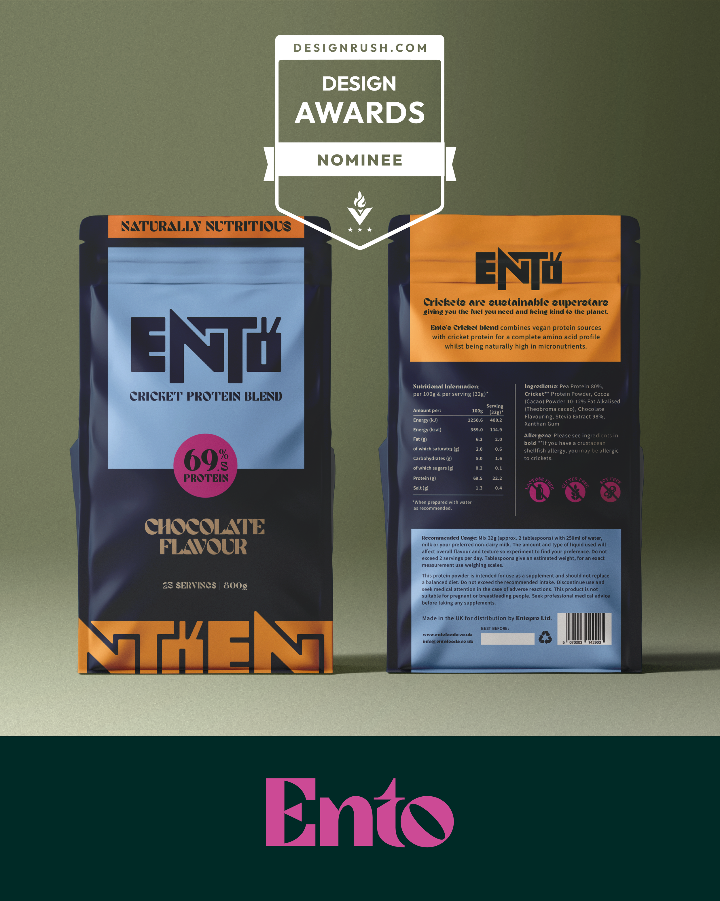
A favourite from 2024 was creating a brand identity for start-up Ento Foods, launching cricket protein blends.
Requiring fewer resources and producing fewer emissions, insects are a sustainable alternative protein source.
Founder Alex wanted something punchy, eye-catching and not too obviously focussed on the insect…
And so the ENTO brand was born.
It started with a hand-drawn logo, inspired by the form of a cricket. It took a while but I knew it was there…The ‘E’ forming the back of the abdomen, the ‘N’ creating the leg shape, whilst the ‘T’ represents the fore leg and wing, with the ‘O’ becoming the head, complete with antennae. This wasn’t a ‘quick job’ or ‘just a logo’ but nobody else will have anything quite like it.
For versatility, a secondary wordmark was created from the brand font, complementing the core brand mark perfectly.
Bold, and a bit weird.
In an emerging fast-growing market you need to stand-out, so we went for it with this one! Really chuffed with this one, and a great client to work with - doing innovative work in sustainable nutrition.
Nominated for Design Rush packaging awards. Project kindly featured on Design Rush discover the best packaging designs.
“I cannot recommend Anna enough, she is super easy to work with and very talented. She quickly managed to create a truly amazing identity for my brand.”
Alex Cheung, Founder at Ento.


